
Announced by the Metropolitan Transportation Authority (MTA), the New York subway will receive a new map for the first time in almost 50 years. Despite the novelty, passengers and transit users were not pleased with the change.
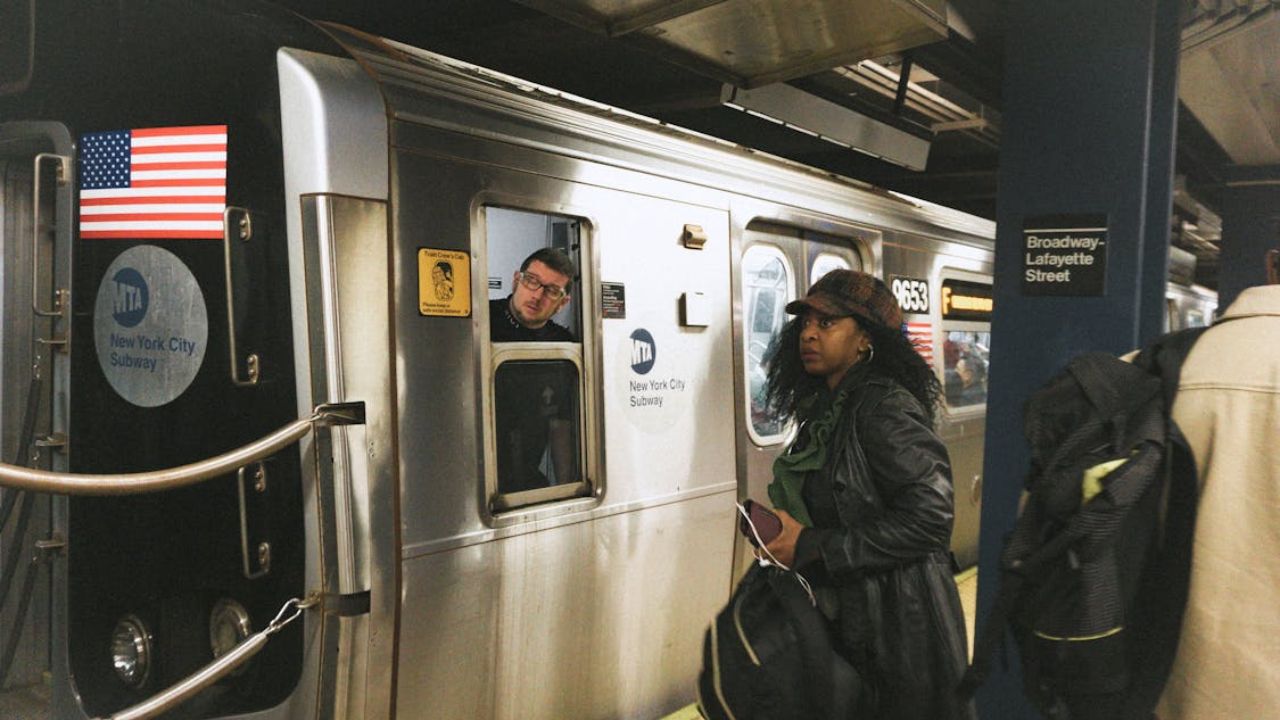
The MTA has unveiled the new design of the New York subway map, and passengers did not receive the change well. This is the first time the map has been updated since 1979.
The previous design was created by Michael Hertz, who became famous for the “spaghetti” style of the diagram, featuring bright lines on a white background to indicate subway routes.
The new map highlights the location of accessible stations and free transfer points between stations, but some New York subway users have called the design a “complicated puzzle.”
“The new MTA is focused on providing a high-quality customer experience in the 21st century, and it was about time our map evolved to match this progress,” said MTA Chairman and CEO Janno Lieber in a statement.
Passengers, however, did not react well to the new map and criticized the changes.
“The map update could have waited. There are other things that need to be prioritized,” said Alisson Graham, 40, who mentioned she would rather see more elevators in stations.
The new version will be rolled out over the coming weeks and months in New York subway stations and train cars.
Say hello to a new subway map! Today, the MTA unveiled a new subway diagram that provides riders with essential travel information in an easily readable, bright, and orderly manner.
Check it out on digital screens in stations, and as it rolls out on train cars over the next… pic.twitter.com/M7OxqL4YQ1
— MTA (@MTA) April 2, 2025
Photos: Pexels. This content was created with AI assistance and reviewed by the editorial team.
